Offer Screen Redesign
The offer screen is the most significant touchpoint for a Grubhub driver because it influences which deliveries to accept or decline, ultimately contributing to driver efficiency, earnings, and overall success.
How might we display offer details in a clear and scannable way, so drivers can feel confident accepting the right offers in order to meet their delivery goals?
Problem
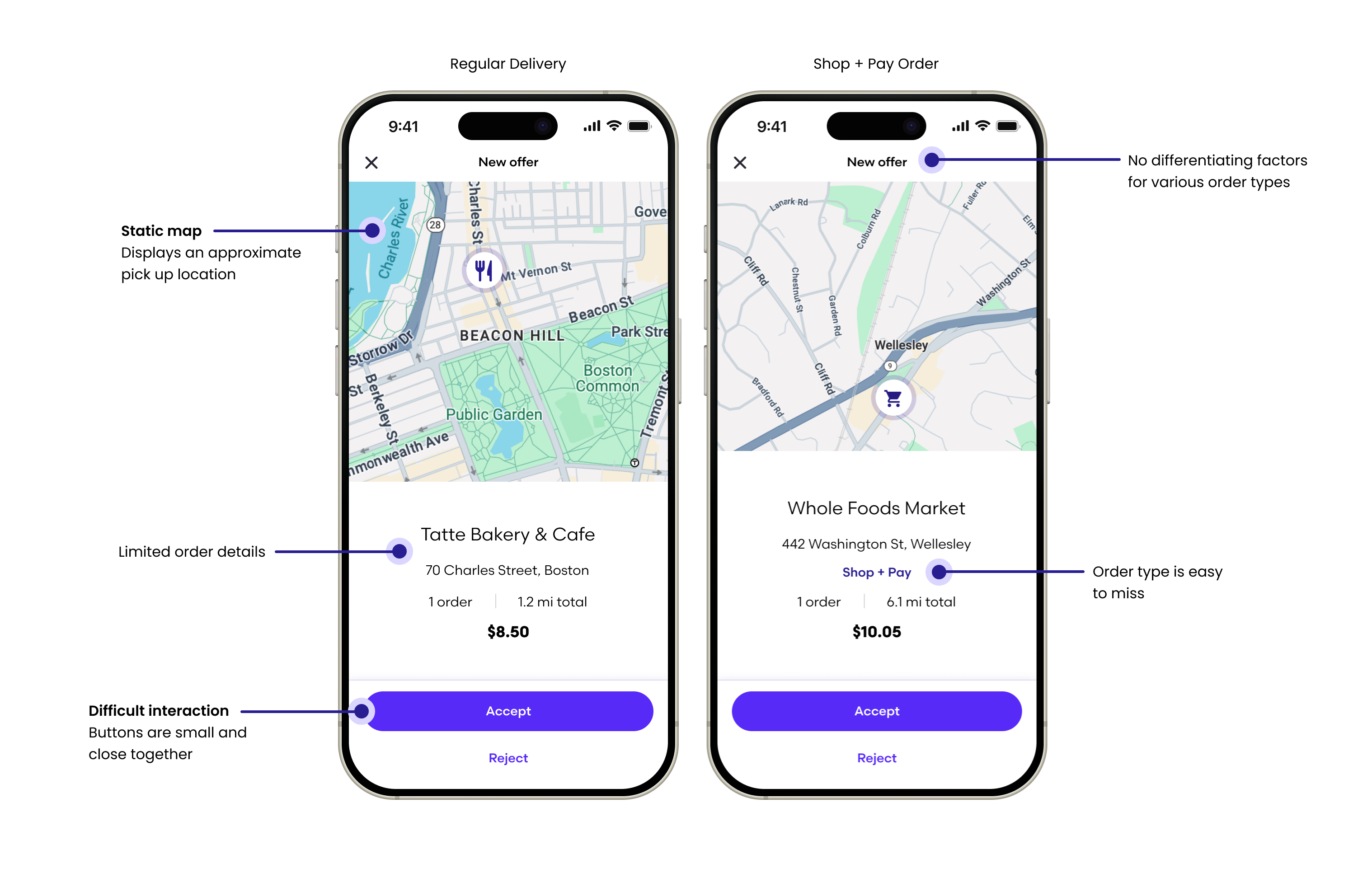
The current offer screen has not only fallen behind its competitors with respect to modern design and safety features, but the UI components are not optimized to support different offer types nor flexible enough to comply with legal requirements that vary from state to state.
Business Goals & Success Metrics
- Improve Unassignment Rate
- Improve Offer-to-Accept (OtA) and Offer-to-Decline (OtD) speed
- Improve flexibility to show different information depending on offer type
- Create a solid foundation for experimentation and iteration
Design Solution
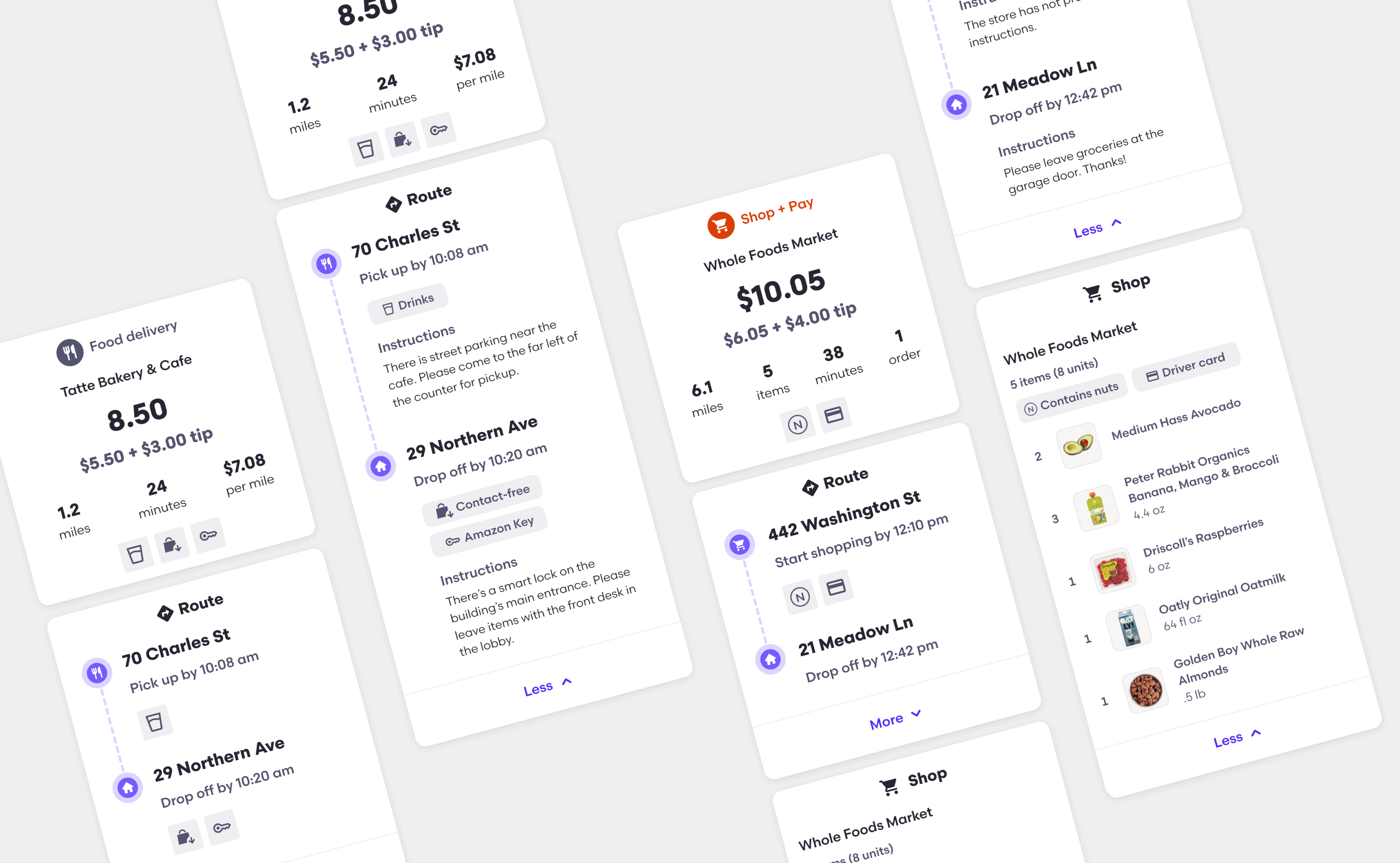
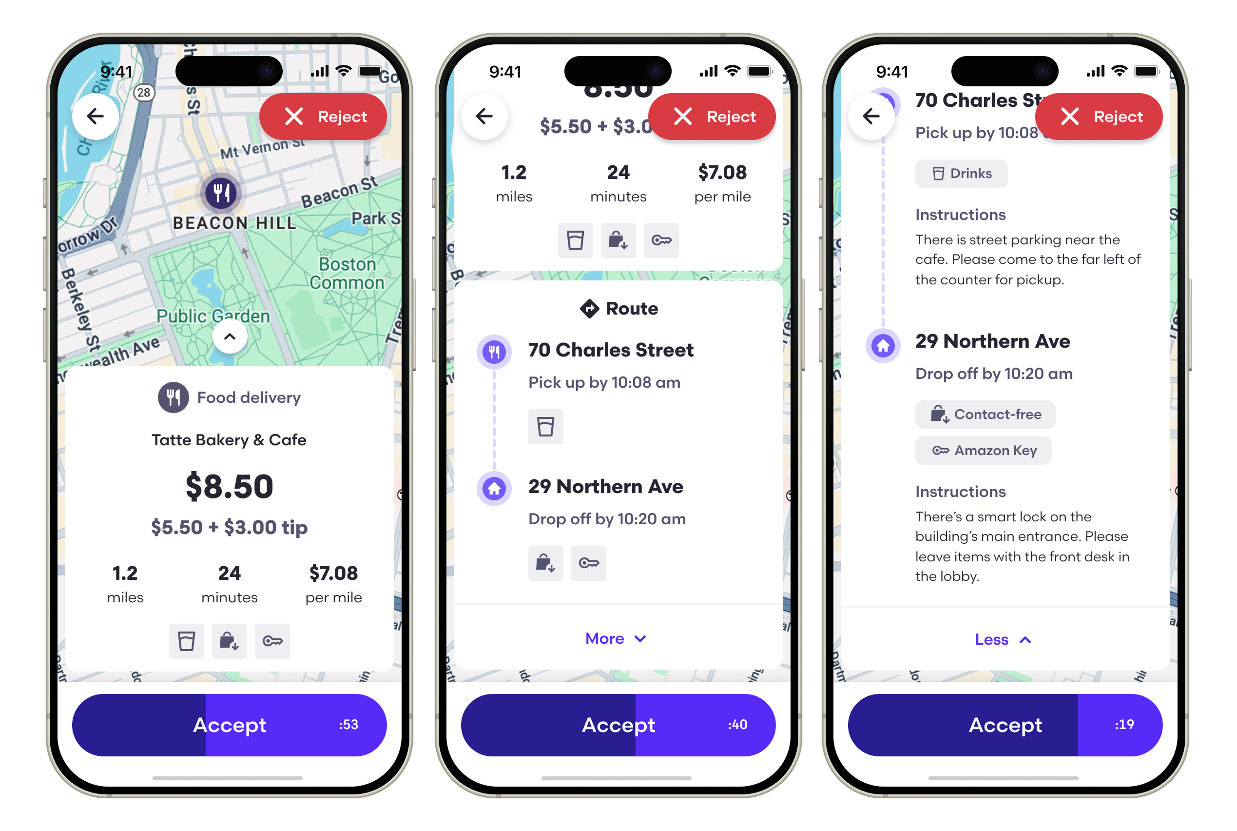
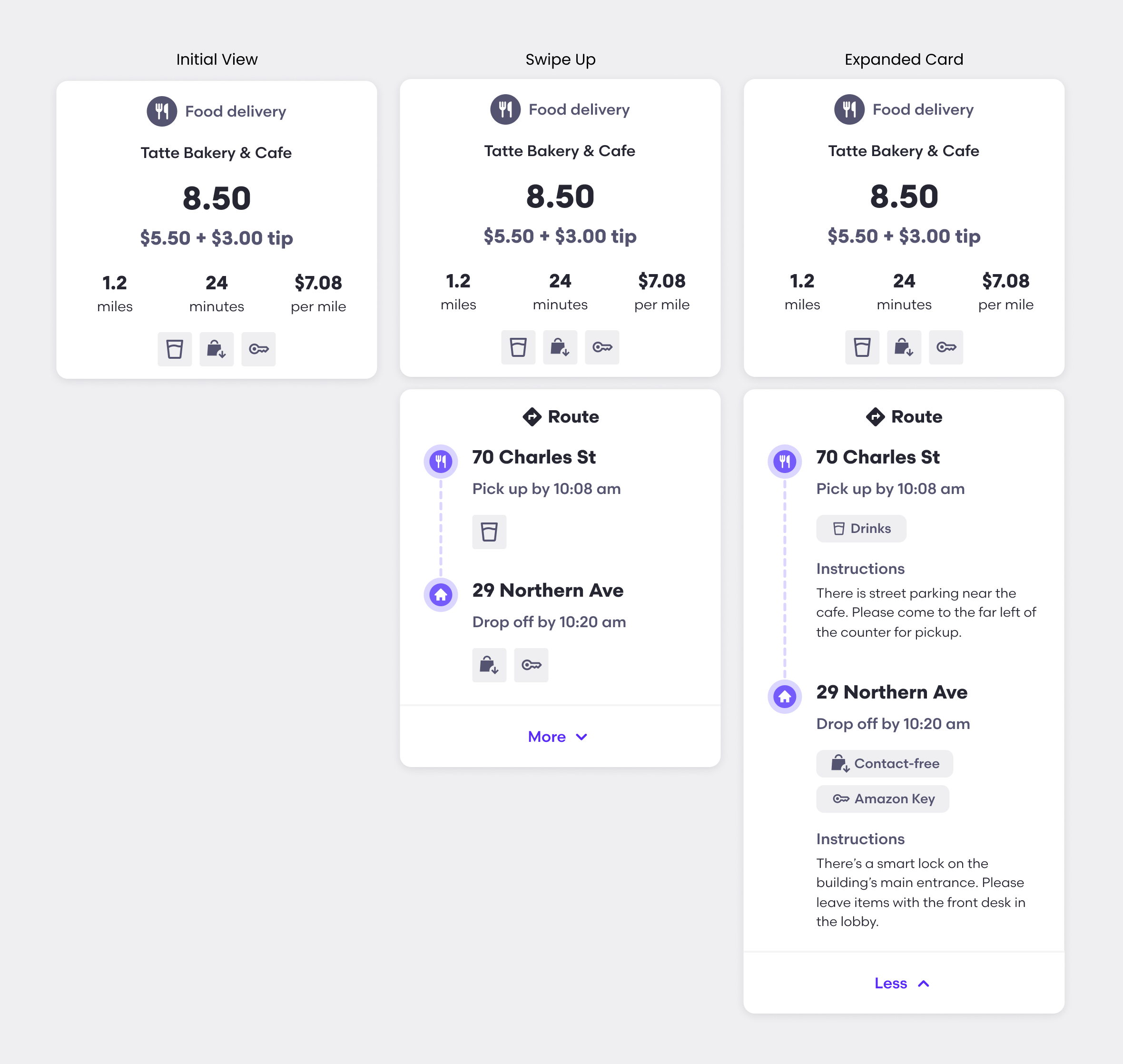
We reimagined the offer screen by creating an expandable offer card with a clear hierarchy of information that leverages iconograhy for better scanability. Additionally, it's built with modular, flexible components that can easily scale and adapt to new offer types, compliance regulations, and future iterations.
My Role
This project stemmed from the output of a 5-day design sprint that I facilitated, where we created high-fi concepts aiming to solve user pain points with the driver task flow based on historical data/research findings. I assembled a focus group of drivers to gather qualitiative feedback on the new concepts. Armed with the positive anecdotes from drivers, I partnered with product to get the offer card redesign prioritized on the roadmap.
Overseeing the design efforts through delivery, I had regular working sessions with the lead designer to brainstorm ideas and provide actionable feedback and guidance. I advocated for the importance of scalability in design and presented the vision for flexible components to executive stakeholders. I also aided in key decision making with product and engineer partners around impact vs. effort and scope to establish our MVP and fast-follows.
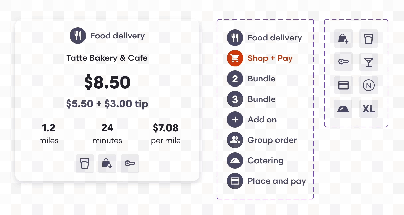
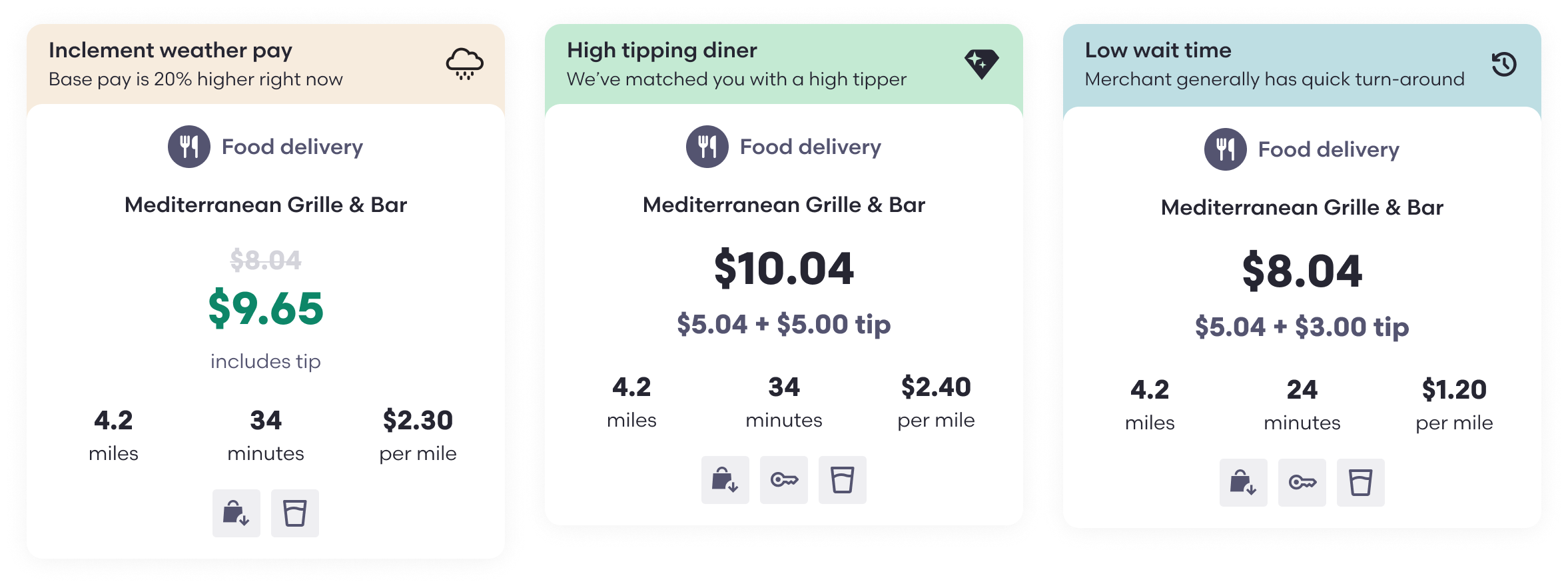
Regular Delivery Offer Card
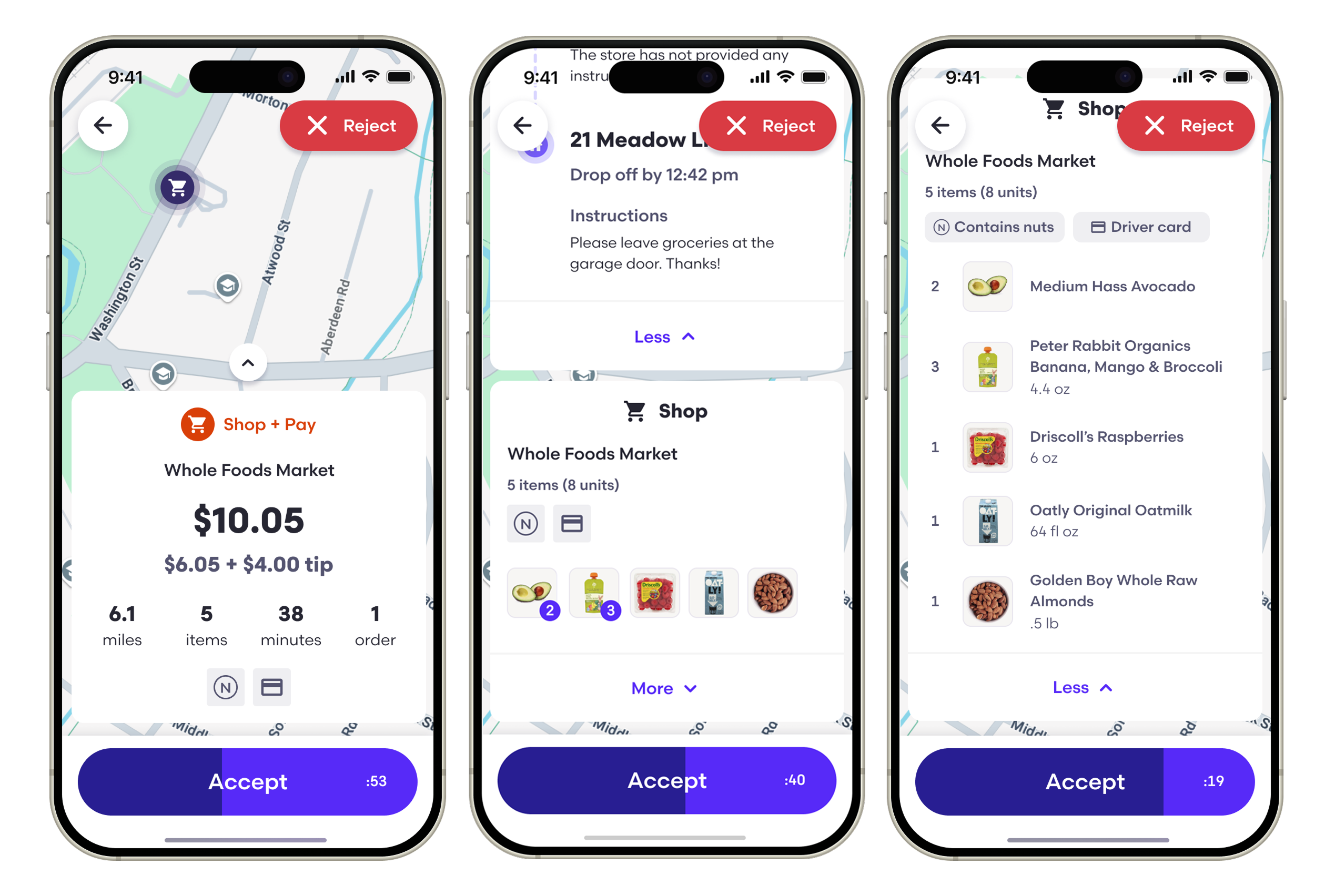
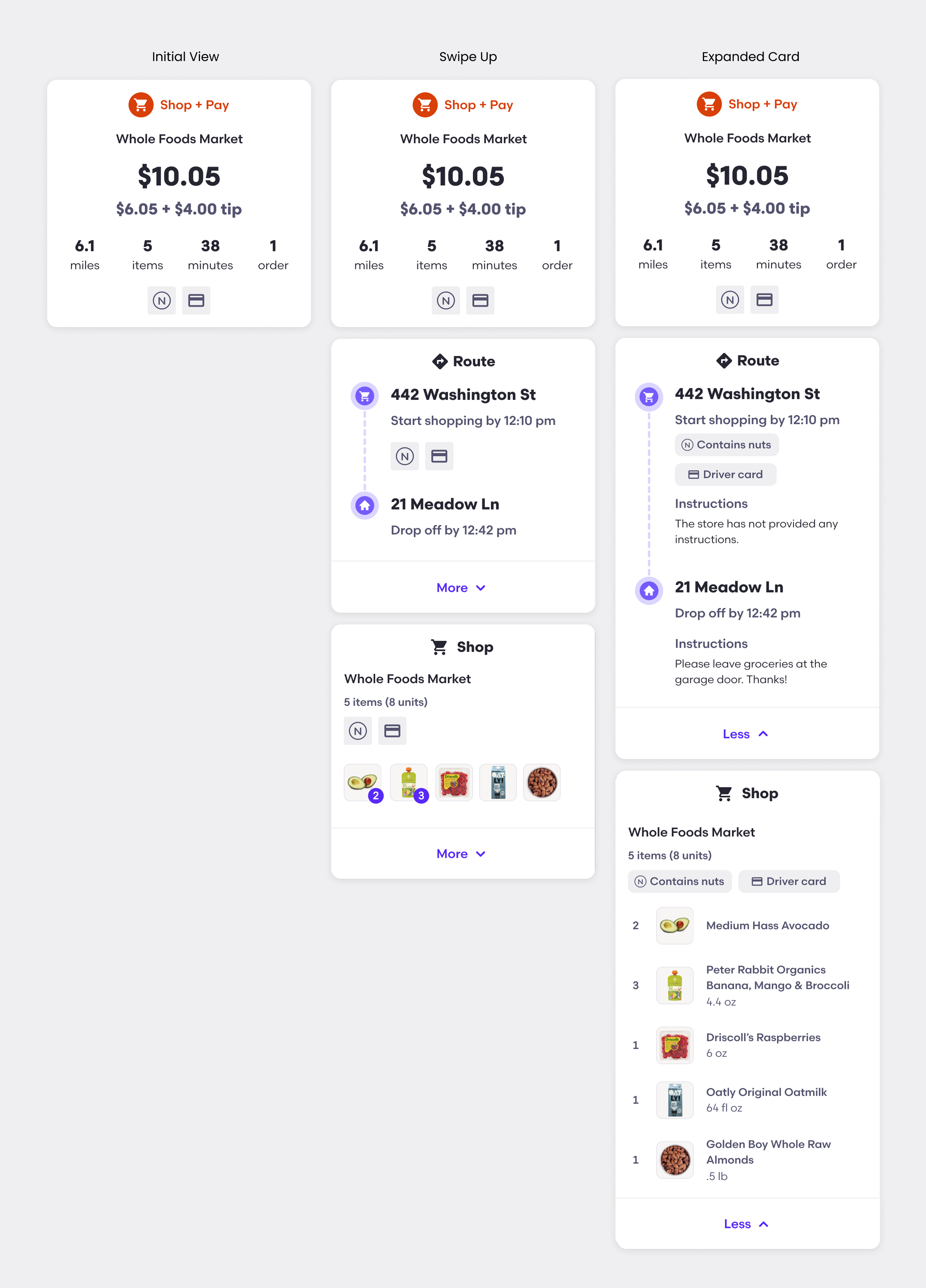
Shop + Pay Offer Card
Importance of Flexible Components
- Design can be more efficient, consistent, and adaptable when new featurs are introduced
- Engineers benefit from speedier delivery long term, simplified maintenance and reusable code
- The business sees faster time to market, reduced design & development costs, rapid testing, and can easily adapt to compliance regulations
Preliminary Results
Since launching to the majority of regions, we've seen a +1% increase in acceptance rate, with $250k in projected annual cost savings. Additionally, based on a driver satisfaction survey, 70% of drivers were "very satisfied" with the updates.
We'll continue to monitor performance and gather feedback for future iterations and improvements.
Quotes from Reddit Users
"New offer layout makes it much easier to decide [whether to accept or decline an offer] because it actually shows me the addresses so you have an idea of where you're going."
"I'm honestly loving it."
"So yesterday I was pleasantly surprised by the new offer screen and new 90 second timer. It shows me everything I needed to know."
Looking Ahead
Offer Incentives
In an effort to reduce the number of rejected offers and "reaps" (when a driver lets the offer time out withouth choosing to accept or reject), we will be testing a variety of monetary and non-monetary offer banners to incentivize drivers to accept.
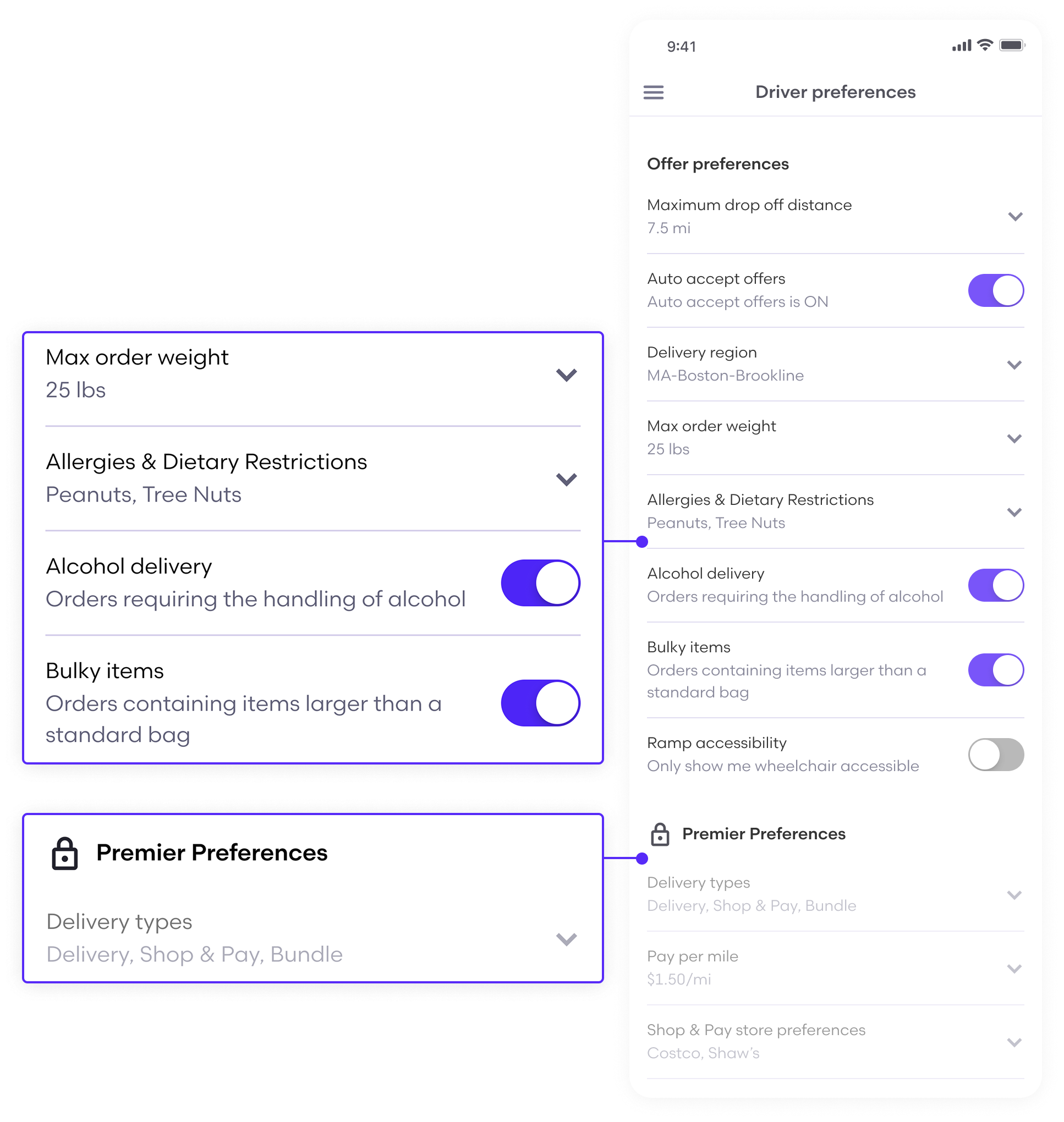
Custom Preferences
Additionally, we want to provide drivers with advanced preferences to ensure the offers they're seeing are right for them, which we believe will improve delivery quality and offer-to-accept/decline speed, among other metrics.


Selected Works
Grubhub | Post-Purchase Experience Design VisionModular Systems Thinking

Grubhub | Same Day Reorder RateDesign Discovery & Strategy

Grubhub | PIN at DropoffMulti-Sided Design

Grubhub | Offer Screen RedesignScalable Design
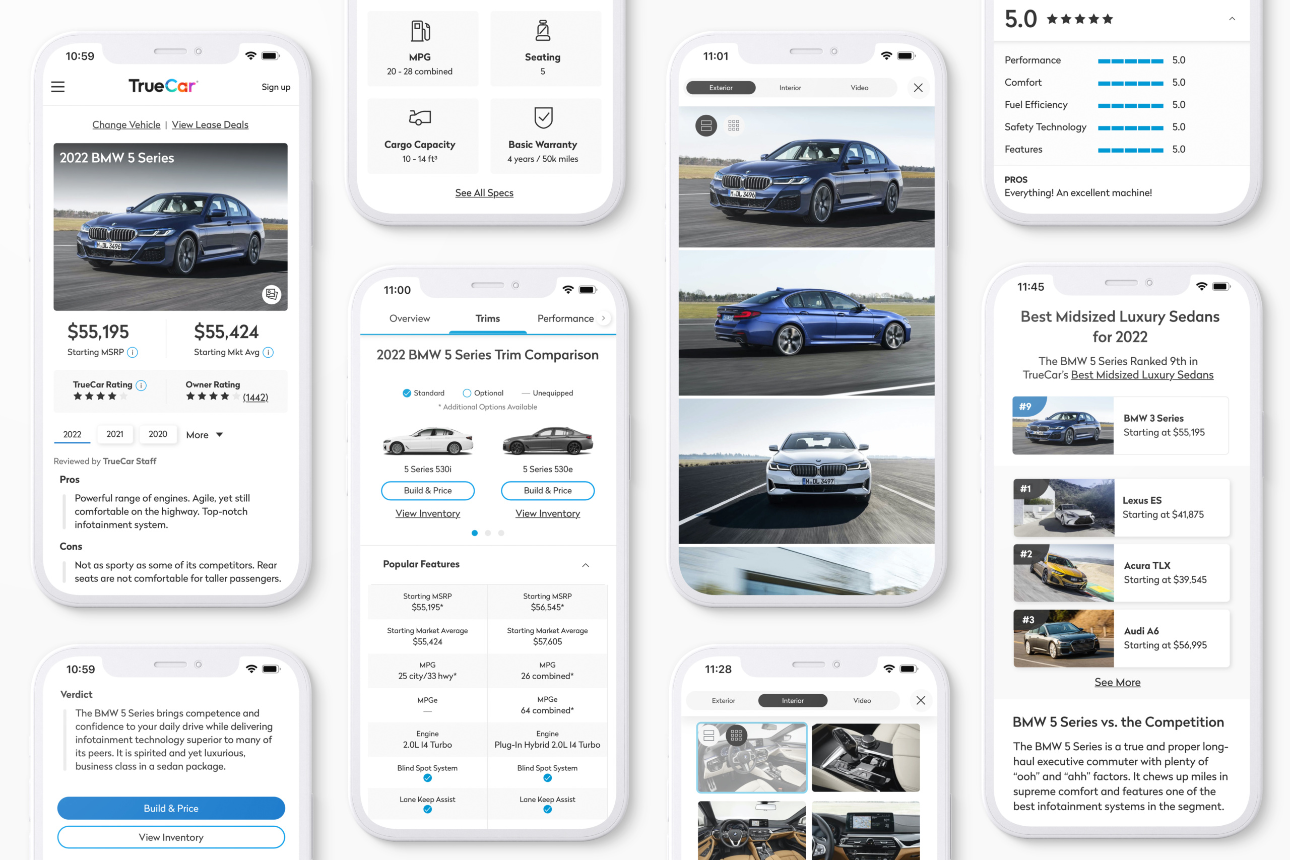
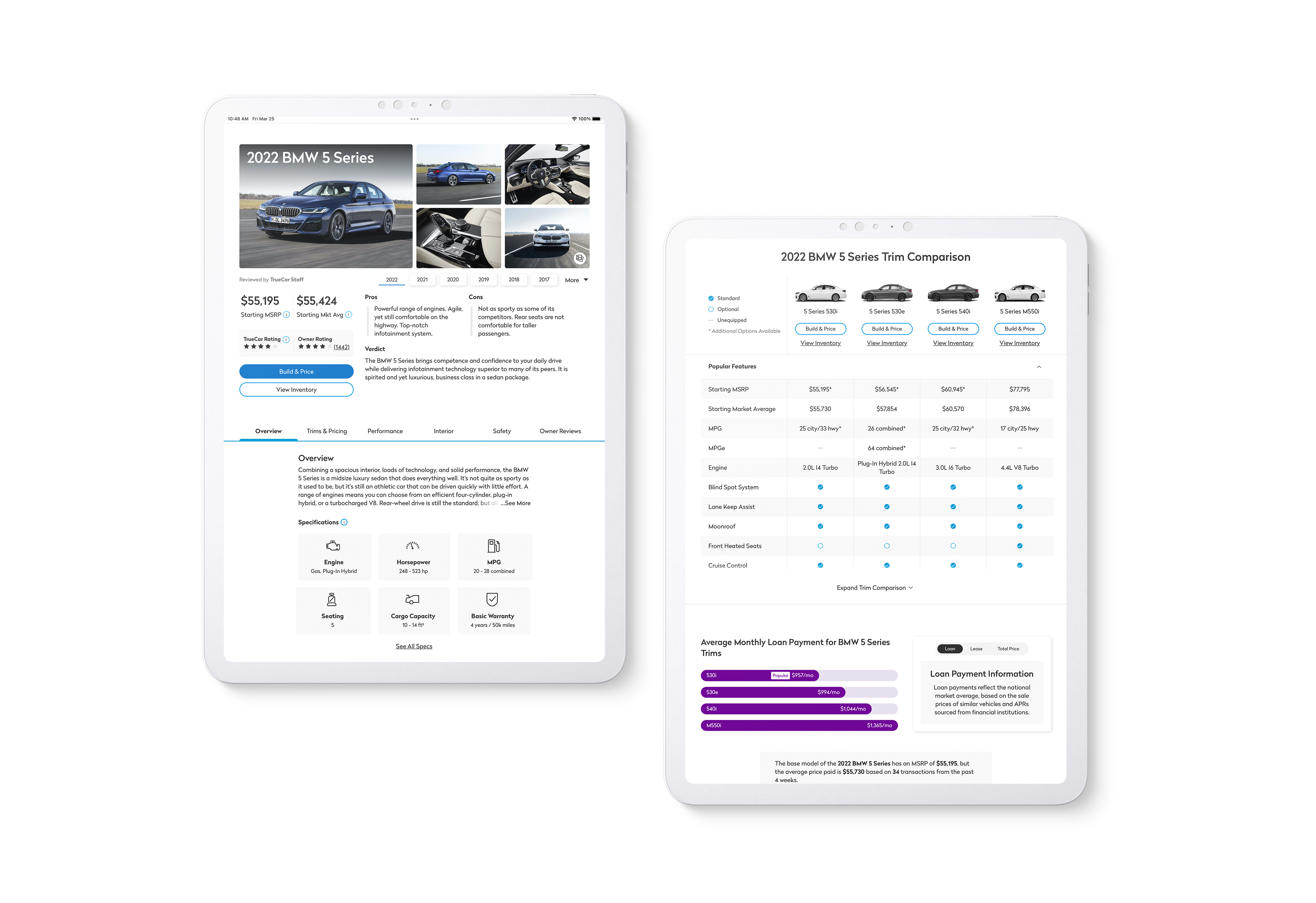
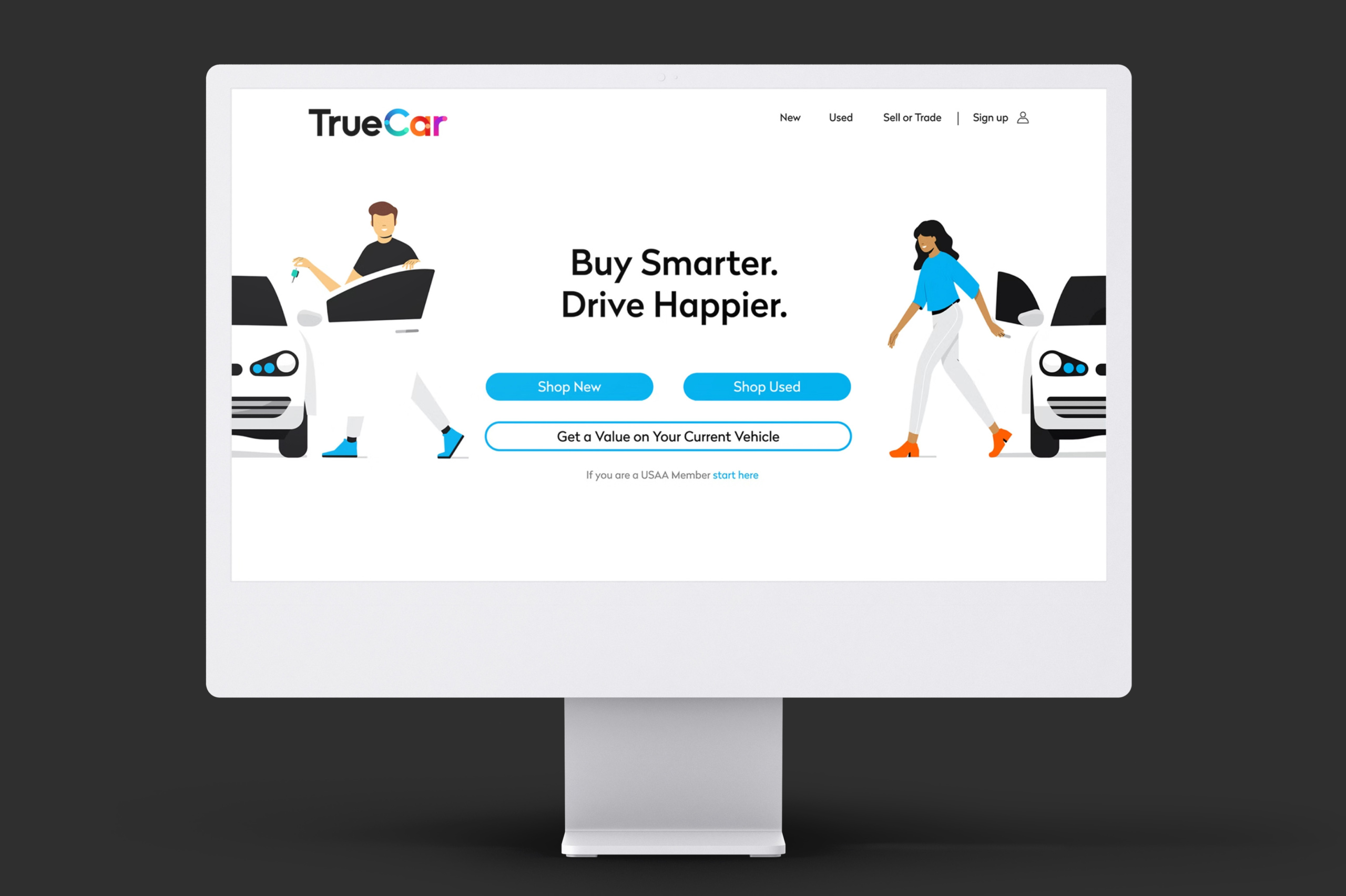
TrueCar | Model OverviewUX/UI Design
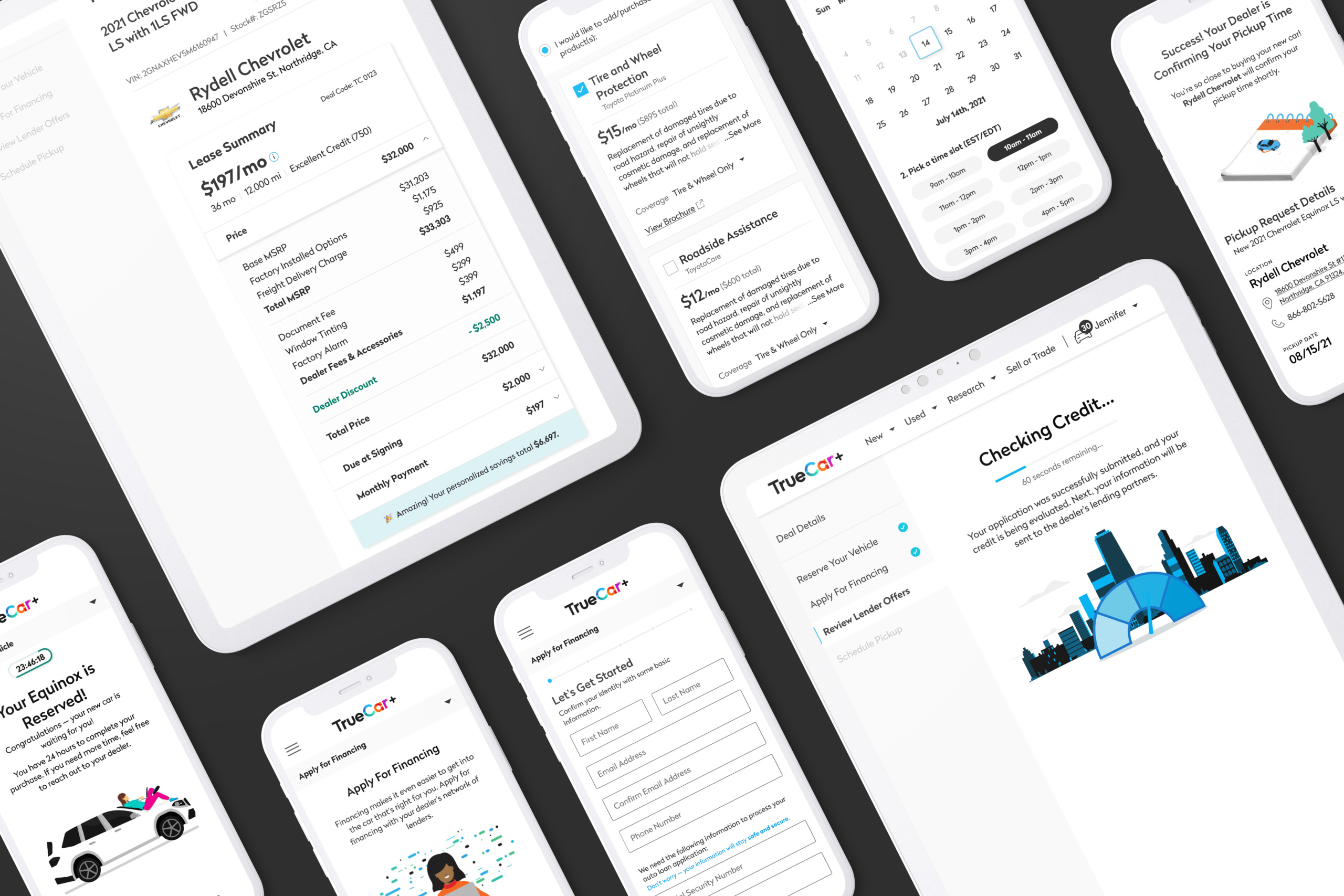
TrueCar+ | Digital RetailingUX/UI Design
TrueCar x Pentagram | RebrandDesign Systems
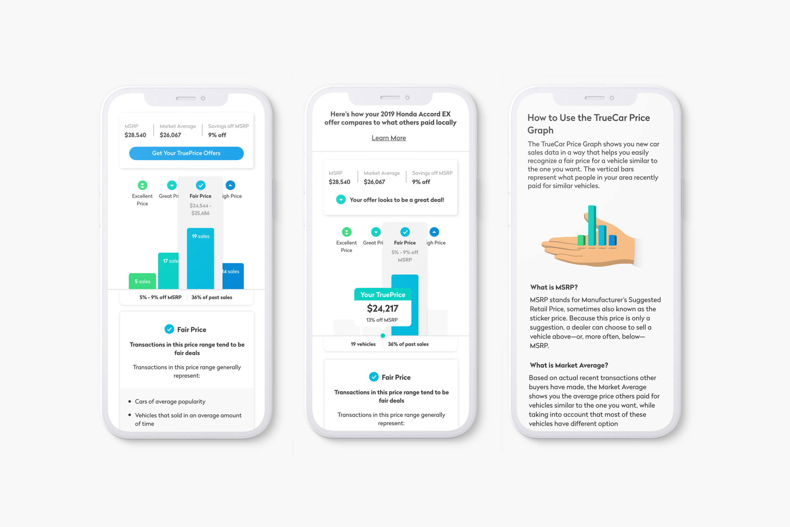
TrueCar | Price GraphData Visualization